Foods & Feelings App
The Problem
Sometimes people may have difficulty deciding what meals to make after a long day of work or classes. They may come home and realize that they only have certain vegetables and ingredients but do not know what they can make with what they have. The Foods & Feelings app was created to help busy people make easy meals that are still healthy and nutritious.
My Role
My role involved early market and user research, ideation, design, prototyping, and usability testing.
Research
I interviewed five people selected from a screener survey and asked them about their household situation and cooking experiences.
The five individuals were people who:
Regularly cook for themselves and/or for other people
Busy college or graduate students, working professionals, and/or homemakers
After analyzing the interview notes, I created an affinity map.
From the affinity map, I found that the research participants:
Gain cooking inspiration/learning from family and friends or online
Notice different ways in which emotions affect meal preparation and cooking outcomes
Save time with meal planning
Are more health conscious about their food choices when they cook
Want to cook easy meals and save time
Personas
After analyzing information obtained from user interviews, I created empathy maps which translated into three personas.
Lesa Santos
Mother who provides for the family
“I feel like feeding people is like my life mission.”
“To be honest, cooking to me is more like a chore I have to do...it is going to be really sad if we have to eat expensive stuff. Like we just want to try to save money and eat at home. Being more healthy is our main reason, but I myself don’t love cooking. I don’t hate it but I wouldn’t say it’s an enjoyment.”
Emma Read
Single young adult who approaches cooking as an art
“[Cooking] is a process of creating. I get to assemble these things in a way that can be aesthetically pleasing and taste good, too.”
Stephanie Chu
college student who cooks to survive
“Whatever I decide to cook is whatever I have in the fridge.”
User Stories
After coming up with some solution ideas, I generated user stories based upon my user research. Once these were written down on post-it notes, I organized them in an affinity map. I then spent some time evaluating the user stories to see how I might prioritize them in order to create the MVP. Since the problem that I wanted to solve was to help busy people find a way to easily figure out what to cook, I wanted to incorporate some elements of that into the design. During my user research, I found it really interesting how emotions are associated with meal preparation and cooking outcomes, so I wanted to incorporate that into the design as well. I went back to the affinity map I created and selected the post-it notes that would help me to achieve these two aspects. This became the MVP.
User Flow
I then created a user flow to help prioritize user needs and determine the critical paths that users might take.
Sketches and Guerilla Usability Testing
After the user story/user flow process, sketches were made to create a paper prototype which was used for guerilla usability testing.
Five participants were interviewed
Paper prototype was created using POP by Marvel
Users were asked to complete two tasks:
Search for a recipe according to their mood
Search for a recipe by ingredient
Overall, users liked searching for recipes by ingredients or by mood
Home Screen
Take a photo, open photo gallery, finalize photos
Usability findings:
Users did not like the bottom navigation bar and the hamburger menu and thought that it would be better to have one or the other but not both
Users were confused about how to proceed after taking photos
Wireflows
After completing the guerilla usability testing, all insight gained was incorporated into the wireframes of the three red routes created in Sketch.
First red route where user can search for recipes by ingredient. User can choose to type the ingredient name or take a photo of the ingredient.
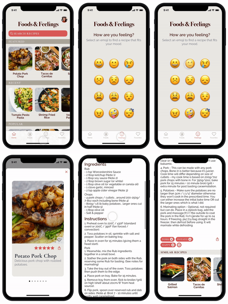
Second red route where user can search for recipes by mood.
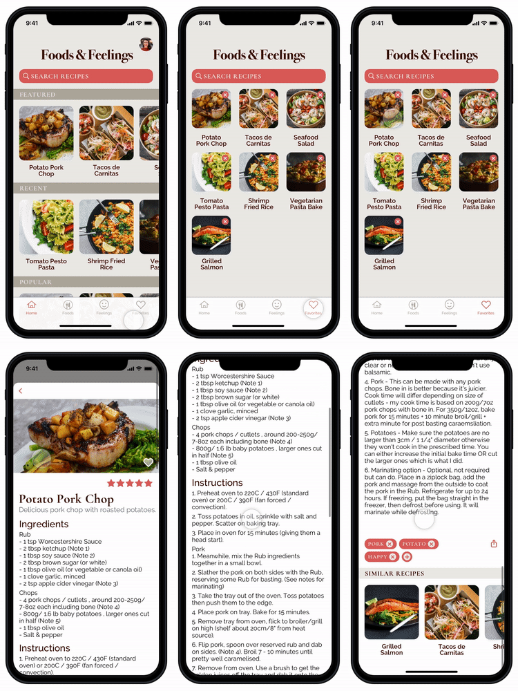
Third red route where user can easily access recipes that they have saved.
Visual Design Process
After the guerilla usability testing, I moved on to creating the visual design by starting with the mood board and then creating a style guide. For the design, I wanted it to be clean and minimalistic but still fun. I chose a natural, earthy color scheme with greens and browns to give a healthy green feel. The fonts I chose were Cormorant Garamond and Raleway. These fonts were chosen to create a formal, clean, but not-too-serious look.
Prototype
I designed screens in Sketch and used InVision to create the interactive prototype.
User can search for recipes by ingredient. User can choose to type the ingredient name or take a photo of the ingredient.
This allows user to easily find recipes to cook with what they have on hand.
User can search for recipes by mood. This adds creativity to the cooking process.
Usability Testing Round 1
Participants consisted of individuals who were busy college or graduate students, homemakers, or working professionals who prepare meals for themselves and/or their family members. Each participant was asked to search for a recipe based upon feelings, share a recipe, search for a recipe by typing ingredients, search for a recipe by taking photos of ingredients, save a recipe, and find all saved recipes.
Usability Findings & Reiterations
Usability Finding 1
Users found it difficult to know where to tap in order to open up the recipe from a recipe card so I changed the hotspot since users would tap the center of the card.
Usability Finding 2
The back arrow was hard to see on the recipe screens causing users to struggle to find a way to go back to the previous screen. The new design allowed for users to easily find the arrow and the favorite icon.
Usability Finding 3
It was unclear to users that the “Take a Photo” button is meant to be a recipe search function where you can search by taking photos. I updated the copy to provide more information and instruction to the user.
Usability Finding 4
Users expressed that there are too many taps involved in getting to the recipe through the feelings search function. I removed one of the screens in the flow to make the process simpler.
Visual Design Updates
After the first round of user testing, a user mentioned studies discussing the effect of color on hunger and satiety. While doing some research, I found that red has been shown to stimulate hunger so I decided to change the color scheme and use reds instead of greens. In addition to making changes to the overall color scheme, I created other updates on the design based on findings from the first round of usability testing. I made improvements to the copy, redesigned the back arrow and favorite elements to make it more visible, and adjusted the hotspots to make it easier for users to move through the app.
Usability Testing Round 2
During the second round of testing, I interviewed five participants and found that the reiterations made significant improvements to the app’s usability. Improvements after reiteration were that:
Users were able to easily open up recipes from the options page
Users were able to find the back arrow
Users found it easier to understand how to use the app
Further changes that can be made include:
Consider removing or changing emojis
Adjust spacing between text lines
Make the share icon larger and do A/B testing to determine best location placement
Lessons Learned
In this project, I learned how to use design thinking in all processes of research and design. I was able to design an app to help busy people make easy meals by using practical search functions to quickly find recipes involving available ingredients at home. A search function for recipes depending on user moods was also included to help make cooking a more creative or fun experience.
It would be interesting to do more usability testing and reiterations to see if there are emojis that are better than others that should be included or if there are any emojis that should be removed. Another interesting usability test would involve diary studies where users use the app to find and cook a recipe to see what other usability problems might be uncovered in different contexts.


